Okay, guys. It’s time for some serious icon style talk.
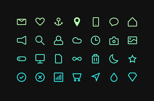
Creating one beautiful icon is easy. Creating a few good looking icons isn’t that hard either. It’s making them cohesive that can knock you down.
Completing a set of coherent icons is a hell of a challenge. In fact, one of the biggest out there in the icon-making world. But that’s why I’m here – to help you overcome them and make your way to the top. Keep reading to get 6 useful tips that will help you master your skills of creating exquisite cohesive icon sets.
Fasten your seatbelts, space cadets, and let’s go! But before we take off –
Why icons should be cohesive?
Well, icon design is so much more than just graphic symbols representing real objects. It is a unique language where each icon is a word that has its own meaning. But it’s not until they are combined together when a proper conversation starts. That’s right, you use icons to communicate with people of the digital world just as you do talking to your mates in a real world.
Using differently styled icons in one set is like mixing different languages in one sentence – even if you are lucky enough to be understood, people won’t take you seriously anyway. Make your icon set cohesive, and it will speak.
Now, let’s get back on track. Here are the tips to create cohesive icon sets.
1. Stick To One Style
Sounds obvious, doesn’t it? However, this is the key point if you want your icons pretty and consistent. Don’t start making any icons until you decide what style they are going to be in.
There are plenty of styles and style variations. Most common ones are: Outline icons, Glyphs, Flat icons, Skeuomorphic icons, Hand drawn, etc. Feel free to follow me on Pinterest for the coolest icons, greatest freebies and some inspiration!
Once you have decided on the style of your future icons, stick to it with each and every icon in the set. An icon in a different style stands out, but not in a good way. It ruins the cohesiveness, beauty and value of the whole set.
From the moment you decided which style to use, all your set icons should be made in the same style. Don’t let differently styled icons kill the set and demolish the hard work behind it.
Take a look at this work by Oliur as at the example:
Do you see how the Pin icon stands out from the rest?
The designer made a mistake when coloring the icons – notice how all the icons are outlined while the pin is filled. Don’t do that!
Anyway, Oliuris a wonderful designer, and the set is great, so
Go and give him a big fat like!
The major question is, which style to choose. There are many factors to take into consideration. And the topic itself is really huge, so I will bring it up in one of my following newsletters.
2. Keep The Same Stylistics
This is slightly different than maintaining the same style.
Every style has its personality. For example, you can make thousands of different outline icon variations. But picking the right stylistics is just as important. Will your icons be detailed or minimalistic? Is it better to have thick or thin lines? Or maybe mixed line weight? And what about the corners: should they be round or sharp? Are you gonna use rounded or butt caps?
Important: Know exactly why did each element the way you did it. Think of all possible details of your future icon set and stick to them till the very end. You can create another set in different stylistics if you want to, but now follow the one you are working in.
3. Size Matters!
Maintain the same size of each icon in the set.
They should not only be in the square frames of the same size, but they should look equal, too! Imagine two same-sized shapes – a circle and a square. A square will always look bigger, because it fills more space. Some changes should be applied to make them visually the same. For instance, scale down the square a little.
Quick trick: A great way to check if your icons look equal size-wise is to print them out and compare to each other. Write down your comments and do some sketches on the same paper to then fix the size issues in Illustrator. Somehow, it’s easier to compare the icons when you have them on paper.
4. Use Grids
Great icon sets are always made using grids. Just don’t overuse them. If you see that your icon looks off trying to fit the grid – screw it! Good sets have a grid, but the worst sets hold strictly onto that grid. 🙂
I’ll write a detailed article about grids in the future, so stay tuned.

5. Use The Same Elements Throughout The Set
It’s simple: If you’ve used a 16px circle in one icon and need a similar circle for another icon, just copy it. No doubts that having the equal-sized objects throughout the set makes it look more cohesive! And copying elements from other icons will save you a ton of time! Trust me on that one.
6. Use The Same Color Palette
Needless to say (but I’ll say it anyway), that identic color combinations should maintain in all icons of the set. Select the colors, add them to swatches and try to use only them. Sure, sometimes you’ll need to make exceptions and add more colors, but boy, will you be amazed how few colors you actually need to color the whole set!
And don’t you ever forget to choose icon recognition over cohesion!
Icon clarity and recognition are what makes a brilliant icon brilliant! Never give up on clarity in favor of cohesion! First and foremost, an icon should deliver the correct message and only then – look good.
Making cohesive icon sets is much harder than it seems. Pay attention to the smallest details, revise your sets over and over again, and always think of the ways to improve the set. With that in mind, you’ll master it in no time! Now go and make some damn cohesive icons!
Stay awesome, space cadets!
![]()


