
Grids, oh, mighty grids! I think this is the most requested article of all times. And yet, in my opinion, grids are overrated. Yep, I said this. Don’t get me wrong, sometimes a great grid is the essential part of a wonderful icon set, but it’s definitely not a necessity. I’m getting a lot of emails from people that haven’t started their first icon set just because they don’t know how to set up a grid. Oh, come on! Let me tell you a secret: you don’t really need a grid for your first icon set. It’s a great practice to create some icons on the grid, but before even thinking about creating your own grid you should make thousands of icons to understand what to take into consideration while making the grid.
So what is icon grid exactly?
Icon grid is most commonly created using the guidelines placed precisely on the artboard. But it is not just about the guidelines, of course. Think of an icon grid as a set of rules made to keep consistency throughout the icon set. Well laid out structure where your icon set is going to be constructed.
People often confuse construction guidelines with icon grids. I’m talking about the guidelines other designers show in their works to demonstrate the process or thoughts behind a certain icon. I think people are obsessed about knowing what is going on behind the scenes of other people’s works. That is why when you put up a work with visible guidelines, it will most likely get more attention than the exact same work but without the guidelines.
If the guidelines are well thought out you can learn a lot from them. For example, look at this great shot by Denis Rodchenko:

Fish icon guidelines by Denis Rodchenko
The designer is sharing the process behind the icon showing his use of geometric shapes to construct the well executed icon. I suggest you go and hit that Follow button on Denis profile. He posts some great icons, and you can learn a lot from his works, take my word.
When to use a grid?
As I’ve said at the beginning of this article, I think grids are overrated. But there are a few occasions when it is crucial to use one.
First of all, I believe that an icon grid must be used if you’re creating a huge set of icons (50+). The more icons you need to create in same style, the more solid the guidelines should be. Stick to them to make a cohesive set. When creating a big icon set, you should decide on the icon grid and all the spacing/aligning rules beforehand. I would say that in this case grid is the most important part of the process and further success of the set depends on it.
Another scenario where you should use a grid is when you’re creating icons for the already existing platforms that have an icon grid. For example, if your icons are intended for iOS or Android, you’d better use their own icon grids. As grids are created to make sure all the icons in the platform stay cohesive, you should follow it to keep the consistency with the rest of the platform.
Grids could also come in handy if you know that somebody else will be working on these icons in the future. Like, when you’re creating just the general icon style, and somebody else will take up from there to continue building the rest of the set. Grid is a lot like a set of rules you need to follow in order to make consistent icons. So that other designer knows from the very start the elements of what size he should use and how they should be placed on the artboard
How to use a grid?
What if you’re working on the specific grid and an icon doesn’t fit in? It loses the meaning, doesn’t deliver the message clearly or simply looks bad? Screw it! I always like to say that all great icon sets have a grid, but all the worst sets stick to the grid strictly. Never compromise the clearness of the message of your icon simply to fit into the grid. Icon grids are just a little help for you to make a coherent set, and it will not be suitable for every icon.
And as I mentioned before, in most cases icon grid is not that important. Most often I’m using the simplest grid possible:
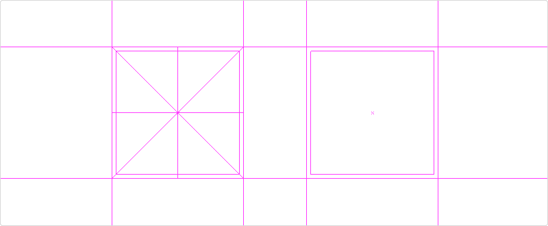
The first version of this grid shows the diagonals and the center of the icon. It really helps to position or balance the icon better. But most of the time I use the second option and simply keep the diagonal and center lines in my head.
The idea behind this grid is that you should be putting your icon into the inner square. And it’s only if you see that the icon needs to be bigger, when you can increase it to the size of the outer square. For example, a square looks visually bigger than the same-sized circle because it takes up more space. So to make them look visually equal, I would make my circle the size of the outer square, and the square like the inner one.
Try creating icons on existing grids
Now I would suggest you to try and create some icons on the existing grid for practice. I’ve bundled together a few great icon grids for you, including Google material design icon grid and two simpler grids I’ve talked about earlier + one a little bit more advanced. You can download them and see how it feels to create icons on a grid. It sure puts some pressure and additional constraints into your icon design process, but it helps to master your skills. (Make sure guides are visible. View > Guides > Show Guides)
Enter Your email to
DOWNLOAD ADOBE ILLUSTRATOR FILES WITH 4 BONUS GRIDS:
![]()


