Today, increasing numbers of healthcare institutions are embracing the Internet to share helpful health information, create professional communities, and to provide online patient care. However, like many other conservative industries, healthcare suffers from a lack of progressive web design, with a well-elaborated UX and detailed approach. Not least are the icons, which can improve usability and make medical website or software recognizable. In this article, Agente unveils some design secrets and shows how to create healthcare icons and make them effective. In the end, you’ll have a chance to download a free medical icons set developed by their design team.
How to get ideas for your medical icon sets?
Every design process has its unique workflow, and icon design is no exception. To make an icon set sharp and elegant, just sitting and drawing is not enough. Only a lot of research, preparation, and iterations will bring your work to perfection. Let’s check the basic steps towards designing an icon set for healthcare.
Define real-life objects in healthcare that you need to illustrate
We all recognize the famous “send” icon in messengers illustrated by a paper plane. The paper sheet which represents mail is combined with the shape of an airplane which constitutes an act of sending. The same should work with healthcare icons to make them recognizable and intuitive. Research the industry or the needs of the specific company to reflect the action by the relevant object.
Example: object—first-aid kit, action—buy medicals; object—radiation sign, action—warn about poisonous elements.
Visualize these objects as sketches.
After you have decided on the set of objects, try to visualize them on paper. Start with the simplest approach, determining whether the icons will be abstract or skeuomorphic, flat or 3D, colored or linear.
Select the variant that best suits the required visual style and context
bear in mind the context where the icons will be used, for example, if you need a set for some specific medical company, you’ll probably have to meet their design identity requirements or maintain their corporate style.
Implement them in graphic editor
And here’s the logical question: what should we use?
Adobe Illustrator is probably the most popular and powerful tool available, with more than 20 years of history and continuous refining of its features. Using Illustrator, you can benefit from multiple third-party plugins and enterprise-level integrations.
Although Sketch is not that mature, it offers good opportunities as a stand-alone app. It allows users to create libraries that comprise icons, colors or components. It has a clean UI, so you can make it work specifically the way you want with customizable toolbars. Moreover, it works better with large icon sets because of extended capabilities for bulk exporting.
Experiment with the form and thickness of lines.
Icons are better when simple and schematic; heavy drop shadows or 3D perspectives are usually excessive and look outdated. Lower the level of detailing by focusing on the basic features of the object, but do not make them too metaphorical.
Think about the keywords related to each of the icons
The meaning of each icon should go without saying, however, the labels are needed to improve usability, and for SEO purpose. For better readability, use several tags, for example, ‘medicine’, ‘pill’, ‘remedy’ for a medical icon which represents a pill.
Test their recognizability in a group of users
Incorrectly used icons can affect the user experience and cause confusion among users. People should understand what happens next when they click the icon and quickly memorize them for further recognizability. All this may be lost on a designer, so every set creation should be followed by iterative user testing with a group of target audience representatives.
Tips to make a perfect icon set:
Turn simple shapes into icons
To start with, you can make your icons using basic shapes—triangle, circle, square, line. It helps you to save time and enhance precision. For example, use elipse and triangle shapes to create a heart icon.
Read more about this: Use Basic Shapes to Create Awesome Icons
Create linear version, then add color
It’s OK to create your first icon designs without color. Go through the shape and lining in detail, and only after that try to incorporate colors.
Use standard sizes
If your client doesn’t request specific icon parameters, go with the standard sizes (e.g., 16×16, 48×48, etc). If you need icons for Android or IOS, consult their guidelines for consistency and scale.
Bear in mind responsiveness
We live now in an era of responsive design, so vector-infused scalability is a must-have. Icons are effective when they work both in really big and really small sizes. Also, keep the location of icons consistent across the devices. Users tend to be more confused when an icon changes its position, whilst they tend not to notice if an icon changes its color or design.
Read more about this: Tips On How To Create a Responsive Icons
Use actual metaphors
Some medical equipment doesn’t make sense for some groups of people. For example, a blood pressure measurement device: home users tend to have an automatic sphygmomanometer at home, so the icon with a manual inflate mode might be understood—but a bit confusing.
Design in several formats
Making an icon set exportable is another challenge for a designer. Both Sketch and Illustrator are rich in tools for masking, adding shadows, borders, groups, etc. Unfortunately, not all of them translate smoothly to svg-format, so sometimes you need to simplify the shape of the icons. However, we suggest not using icon fonts, as they lack readability, fail frequently, and they may be unpronounceable for screen readers.
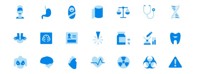
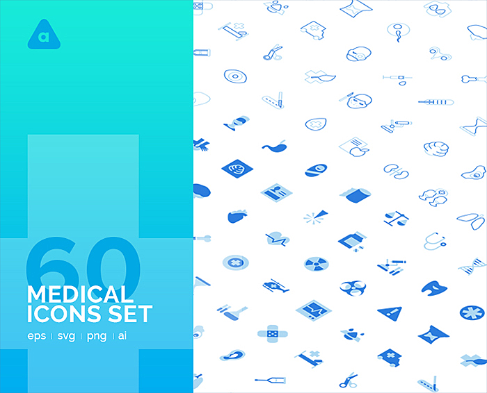
Free medical icons from Agente
The Agente team is proud to introduce our new set of free healthcare icons, developed according to above-mentioned best practices: vector-infused scalability, perfect alignment, and multi-format. We have covered all the main categories of healthcare from medical devices and doctor tools to check-up routines and body parts. You can download them in eps, svg, png, and ai formats.
Where can you use it?
- Websites or apps of a clinic or hospital
- Internal portals for medical staff
- CRM or ERP systems
- Digital health systems
- Telehealthcare apps
- Any other web or mobile app
Final takeaway
We hope that you’ll find our article useful and meaningful, so that it will inspire you to perform awesome work. Get more ideas from the set of medical icons developed by Agente. You can download them here for free. Check out other free icon sets from Agente for travel, world capitals and cities, and fintech.
![]()


