
I’d be lying if I said that I wouldn’t want to create the icons for the Olympic Games one day. I think this is an every designer’s dream.
Icons representing sport disciplines have become an essential feature of the Olympic Games, and usually they tend to reflect the hosting nation’s culture. Good iconography is crucial for the Olympics because it attracts people from all around the world. Therefore, overcoming the language barrier is extremely important.
Since I can remember, I have always been fascinated by the iconography used for the Olympic Games. And recently, while doing my research on the Rio Olympics pictograms, I came up with the idea to collect and share with you all the pictograms that have been made up until this year. So I invite you to go on a journey in time and see how the Olympic iconography has changed throughout the years.
1964, Tokyo
Officially, for the first time icons were introduced and added to the Olympic design programs in 1964 at the Tokyo Olympic Games. They were designed by Masasa Katzumie as the artistic director and Yoshiro Yamashita as the graphic designer.

1964 Tokyo Olympic Games pictograms
However, it was not the first time icons were used in the Olympic Games. The Berlin 1936 Games and the London 1948 Games had unofficial sport discipline icons. I really like the iconography approach of the Berlin Olympics. It has a clearly visible design system and the structure that keeps all the pictograms consistent, as opposed to the London Games’ pictograms that look more like freehand drawings.
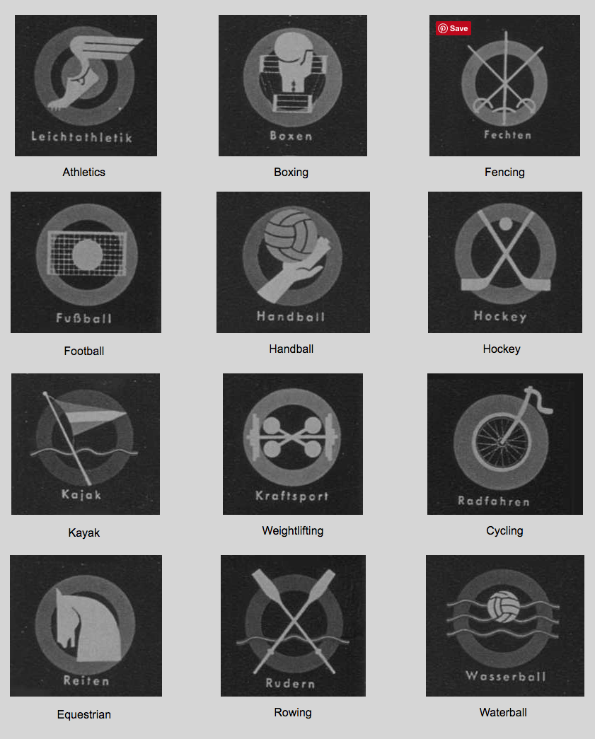
1936 Berlin Olympic Games Pictograms
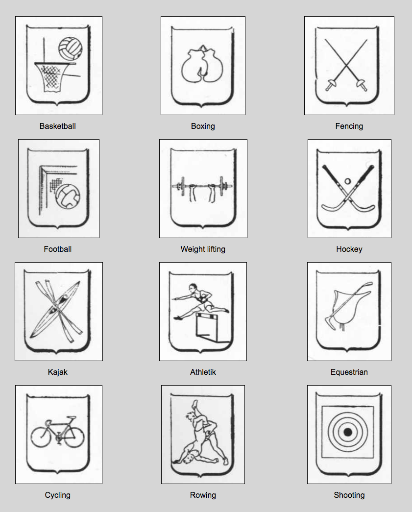
1948 London Olympic Games pictograms
1968, Mexico
For the Mexico 1968 Olympic Games, really bold and colourful icons were created by Lance Wyman

1968 Mexico City Olympic Games pictograms
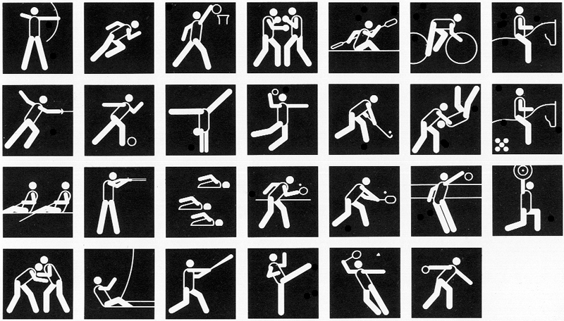
1972, Munich
The most famous of the Olympic icons must be the pictograms by Otl Aicher made for the Munich Games in 1972.
This legendary icon system was designed on a really tight grid, and yet it looks incredibly dynamic and represents the action of every sport. More than that, the icons were made from basic shapes without any unnecessary elements. The perfect amount of details to get the message across. These pictograms were also used for the Montreal 1976 games. And you can feel the influence it had on the Olympic design of the pictograms a lot in the upcoming Games.
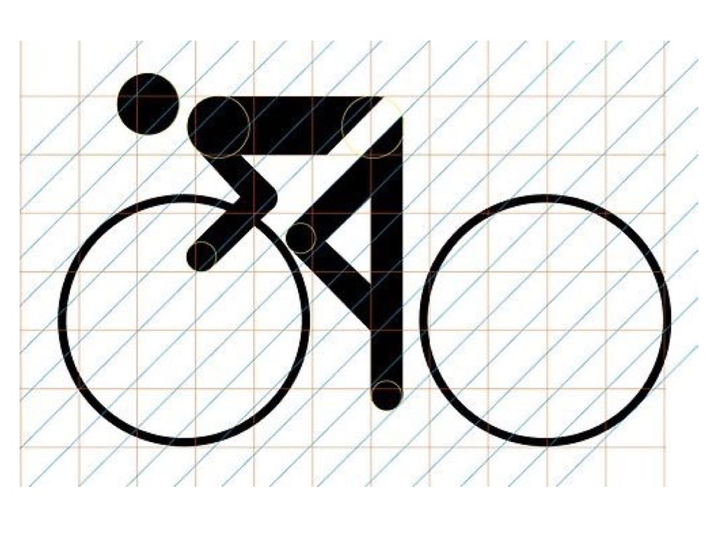
Munich Olympic Games 1972 Cycling Pictogram Grid

1972 Munich Olympic Games pictograms
You can check out all the pictograms for the Munich Olympics here
1980, Moscow
The pictograms for the Moscow 1980 Games were designed by a newly graduated architect Nikolai Belkow.
His icons look bold, with rounded corners and the 30-60 degrees angles instead of 45-90. They have both solid and outline versions and can be used on the black and white backgrounds.

1980 Moscow Olympic Games pictograms

1980 Moscow Olympic Games pictogram grid
1984, Los Angeles
Before the Los Angeles 1984 Games, even six criteria were set as the essentials for a successful pictogram:
- Clear communication; pictograms, by themselves, should be recognizable by people of other nations.
- Consistency; the pictograms should be identifiable as a set, through uniform treatment of scale, style and subject.
- Legibility and practicality; they should be highly visible, easy to reproduce in any scale and in positive or negative form.
- Flexibility; the pictograms should not be dependent upon a border and should work equally well in a positive or negative form.
- Design distinction; the pictograms should avoid stylistic fads or a commercial appearance and should imply to a worldwide audience that Los Angeles has a sophisticated, creative culture.
- Compatibility; they should be attractive when used with their Los Angeles Olympic design elements and typestyles.
These new pictograms met all the criteria. They were easily noticeable from the distance and clearly delivered the message; the system of modular forms and a common scale also made them consistent. People silhouettes of 10 shapes were used for these icons. This system was also practical and flexible as it allowed a variety of positions to be created with just a few design modifications.

1984 Los Angeles Olympic Games pictograms
1988, Seoul
The Seoul Olympics stood out from the previous Games because their composition was divided into a trunk, arms, legs and a head. The connecting parts for arms and legs were made in a very simple and clear fashion, but they still resembled the human body.
1988 Seoul Olympic Games Pictograms
1992, Barcelona
The pictograms for these Olympics haven’t changed drastically since 1972. However, at the Barcelona 1992 Games we can see some really distinguishable changes. These icons designed by Josep. M. Trias abandoned geometric principles of the earlier icons and presented more freely drawn characteristic lines. The designer also simplified the human body leaves it to the three main elements: head, hands and legs.

1992 Barcelona Olympic Games Pictograms
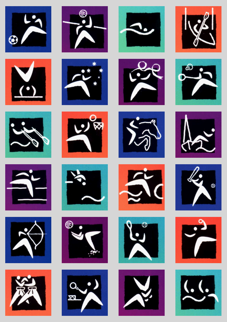
1996, Atlanta
Similarly to the ones of the Barcelona Games, the icons for the Atlanta Olympics didn’t follow the geometric principles. Instead, the designer used more natural human silhouettes.

1996 Atlanta Olympic Games Pictograms
2000, Sydney
A traditional weapon of the aboriginals — a boomerang — was used for all of the icons. This new usage of the same element makes the set really cohesive.
2000 Sydney Olympic Games Pictograms
2004, Athens
These icons are inspired by the elements of the ancient Greek civilisation. Artistic look and the stylistics derive from the ancient Greek vases.

2004 Athens Olympic Games Pictograms
2008, Beijing
The Beijing icons are called “The Beauty of Seal Characters”. They were based on Jingwen, the script found on the 2,000-year-old bronze carvings. They were later modernised and recreated with the bold hand drawn lines that gives the set a really dynamic look.
2008 Beijing Olympic Games Pictograms
2012, London
These pictograms have two variations. The set of simple silhouettes for better visibility and recognisability, and a more “dynamic” alternative version to be used in decorative applications.
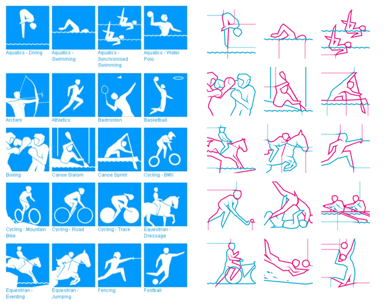
2012 London Olympic Games Pictograms
2016, Rio de Janeiro
This year’s Olympic Games are represented with a dynamic, shape-changing icon system based on the typography of the Rio Games logo. The pebble shapes support designs and change their shape according to the athlete’s silhouette. Also, for the first time in history of the Games, Rio is delivering pictograms for each Paralympic sport.

2016 Rio de Janeiro Olympic Games pictograms
Watch the design process of the Rio Games’ iconography:
Hope you have enjoyed this little retrospective review of the Olympic iconography. Enjoy watching the Games and support your teams!
![]()


