
If you’re selling or planning to sell stock icons online, this article is a must read! The amazing team from Iconfinder was so incredibly kind to have shared their data to help icon designers like you and I to succeed in selling stock icons. If you have ever tried to do it, you will already know how important it is to pick the right niche. Of course, you can always try and guess what customers want, but you don’t want to spend hours creating an icon set just to see that nobody is interested in it, do you? That is a waste of time and your energy. I would get up the nerve to say that doing proper market research might be even more important than creating the set itself.
Here is a practical example:
A long time ago, I published a love-themed icon set prior to St. Valentine’s day on Creative Market. It was doing good for a niche topic like this, but nothing special. One day, guys from Creative Market decided to share their data with all the most popular things their customers searched for. I noticed that “wedding” was trending. That was when I got an idea to have an experiment. I changed the name of my set from “Love/Valentine icons” to “Wedding icons”, and the sales just ramped up! After that, I added a couple more icons, made the presentation more wedding-related, raised the price and published it as a new icon set. Guess, how much did the sales grow? By almost 600%!
So you can see how “doing your homework” could benefit your career as an icon designer. The problem is though, that marketplaces rarely share data like this. That’s why I’m extremely happy to see that Iconfinder is working so openly with icon designers to make this industry better for all of us!
Whether you are already selling stock icons or only plan to, this article is a must-read!
The icon market has gone through several phases since “the early days” when buying and selling icons became a major market. Early on there were very few designers selling high-quality or what we call “Premium” icons. These designers were able to earn a lot of revenue by getting to a new market first. As inevitably happens, though, other designers realized there was a virtually untapped market and so started flooding the various marketplaces with premium icons of their own.Eventually, in any market, a saturation point is reached where there are hundreds or even thousands of designers producing tens or hundreds of thousands of high-quality products to meet demand. Early on, demand is very high and supply very low. In the middle phase supply and demand are proportionate. In the later phase, supply greatly outnumbers demand. This is where we are in the development of the market, or at least parts of it.
As stated above, the purpose of this article is to help you, the designer, better understand customer behavior and trends on Iconfinder so that you can make more informed decisions about which icons to create to meet existing demand, identify new demand, and to discover existing but unmet demand.
Organization of this article
The data contained in this article has been collected from all sales activity on Iconfinder from 1 January, 2016 – 31 December, 2016. We have intentionally omitted raw sales numbers and monetary amounts because the share of sales (percentage of total sales) that a category accounts for is more meaningful than the number of sales or price of sales. All numbers are based on individual icon purchases whether as part of a set, from a Pro Subscription, or individual icon purchases because single icon sales is the common denominator regardless of the type of purchase.
This document has five sections:
- Top 1,000 searches with no results
- Top search refinements
- Share of sales by category
- Monthly sales trends for key categories
- Monthly sales trends by icon style
You will find both the No results and Search Refinement reports in the Google Docs spreadsheet below. Use the tabs in the spreadsheet to navigate between the reports.
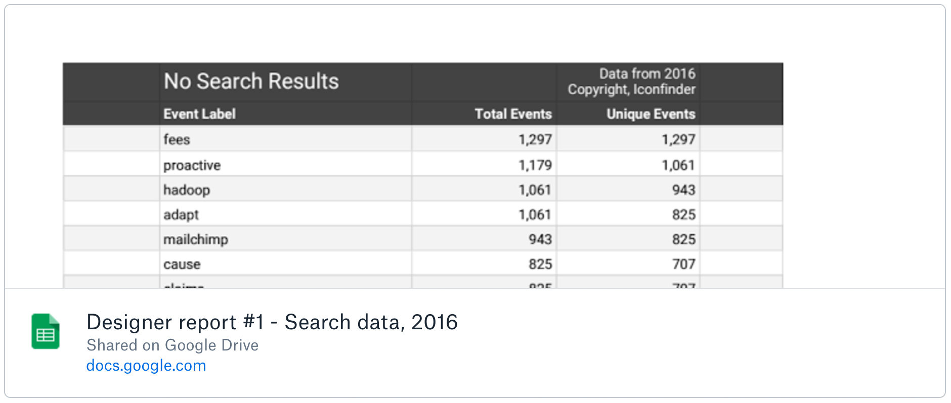
Top 1,000 Searches with No Results
Searches with no results are important because they tell us that there is a potentially unmet demand. In other words, a user has searched for a keyword or concept with they did not find.
We have cleaned this list for misspellings and search terms in other languages than English.
You might already have icons that matches these search terms, but you are missing a tag.

Chart above – Search with no results accounts for about 4% of all searches on Iconfinder.
Top Search Refinements
Search Refinements are searches on which a user searches for a keyword, doesn’t find what they want, and enters a modified search. These refinements are similar to searches with no results in that they point to potential unfulfilled demand but with two key differences. First, the initial search does return results, just not the results the user wants. Second, the initial results are related to what the customer wants but do not quite match it.

Chart above – Downloads per search is about 58%. There is definitely room for improvement.
Supply and Demand
The second set of data will give you an overview of supply and demand for 2016 broken down by categories. You can find the report below in the Google Docs spreadsheet.
![]()
Key findings in Supply and Demand data
The information below shows the percentage of total single icon sales that each category accounts for on Iconfinder. When reading this data it is important not to assume that because a single category might account for a lower percentage of sales that it is not worth creating icons for that category.


Keep in mind that digital product sales is often a “long tail” business model. What this means is that while one or two categories or products may account for a large number of sales, categories or products lower down on the scale, when combined, account for a higher, often much higher, number of sales.

Looking at the data below you can see that Business & Finance accounts for approximately 13% of total sales on Iconfinder, which is much higher than almost every other category. But Business & Finance also has a much higher number of icons in it, which means that it is much more competitive and harder to make sales. If we look at the other end of the chart, where there are fewer overall sales, one could make just as many, if not more, sales by creating a smaller number of icons for several categories. This number is shown in the spreadsheet as the Supply & demand ratio. It is generally best for a category to have a low ratio since there is the least icons per dollar spent. However you should also take into consideration the total available revenue being spent in the category. So you might own 100% in a category, but if there are few sales, it could potentially not be interesting. On the other hand, owning a slice of popular category such as SEO & web could be very interesting.
Below is a graph showing this ratio per category.

We are not suggesting that designers should not create icons for the top categories. In fact, we recommend that every designer do exactly that. However, we are pointing out that the savvy designer should not discount the lower end of the spectrum simply because they account for fewer sales. When added together, these smaller categories still provide a tremendous opportunity. The trick is to find a category with relatively low supply, reasonably constant demand, and moderate competitiveness.
Monthly Sales Trends for key Categories
![]()
In general it is a good idea to have icons on Iconfinder for longer because it takes a few months for icons to build up a high enough popularity score to appear high in search results. However, in some cases, when combined with effective marketing on social media, timing the market based on when peak sales occur for key categories can be a good strategy to maximize sales.
It seems almost like common sense to state that business is seasonal. When is someone most likely to buy icons related to summer? In October? Probably not. However, they may or may not be inclined to buy the most number of summer-related icons in July either.
In the data below you can see when each category peaks in sales. Some results are, perhaps, exactly what one would expect. For instance, sales of icons related to Christmas start to pick up in November and peak in December. This makes perfect sense. However, icons related to Easter do not follow the same pattern. Notice that Easter-related icons actually peak in December, four months before the actual holiday, and are relatively low in April when Easter occurs.
It is hard to state definitively why Easter-themed icons sell most in December but we do have a hypothesis. Easter and Christmas are the two major Christian holidays. Many Easter concepts can easily be used at Christmas. No, Easter bunnies and Easter eggs don’t exactly scream “Merry Christmas” but for many users concepts such as Jesus and the Cross apply to Christmas as well as to Easter. And since Christmas is a bigger holiday, we expect to see more sales.
Our point is not really about Christmas or Christianity but about concepts that are related and how to read between the lines in the data. When you create icons, also try to consider ideas, actions, and objects that are related but not necessarily directly. Icons that are related to a single or multiple themes will have greater appeal in combination to potential customers.
Monthly Sales Trends by Icon Styles
![]()
Design styles and trends tend to last longer than 1, 2, or even a few months. We have included the month-to-month trends in sales by icon style but we expect the relative volumes to remain fairly constant for the foreseeable future. Design trends tend to last for several years. What is especially interesting about the sales by icon styles, however, is that the data yields some unexpected results. For instance, we have known for some time that despite the recent popularity of the flat and outline styles, Glyph icons are still the most popular, albeit by less of a margin.
What we did not expect, however, is that despite the fact that the “Filled Outline” style is very popular amongst icon designers and on show-and-tell sites like Dribbble, the sales volume of this style is surprisingly low compared to the three most popular styles (Glyph, Flat, and Outline). Icon designers may like the style, but apparently customers are not yet convinced.
The data represented in this article and the accompanying charts and spreadsheets is only the beginning. We will continue to share our data and analysis with you, our designers.
The Iconfinder Team
Ieva, Monica, Morten, Oliver, Matias, Emil, Scott and Martin
So what are you waiting for? Now put all the knowledge you’ve got from reading the article into practice. Analyze the data, create your next best-selling icon set and upload it to Iconfinder.
P.S. For this article, I’ve been using my referral links to Iconfinder. If you sign up to Iconfinder Pro, you will get a 50% discount on your first month, and it will help me to pay for the hosting of this blog. That’s a win-win.
![]()


