
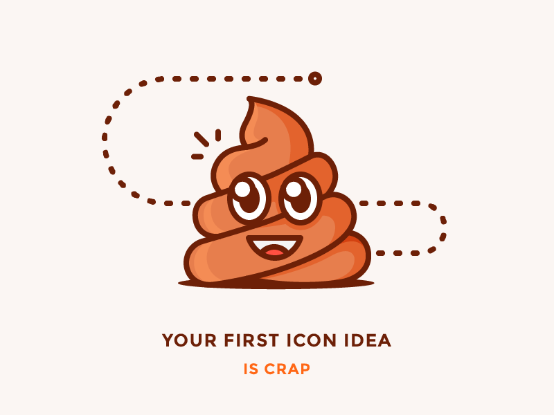
Your first icon idea sucks.
Okay, it may not be that bad… Frankly, I just needed to really grab your attention. However, the truth is that most of the first ideas you have are indeed not your best ones. Sadly, we tend to completely fall for our first thoughts way too often instead of looking for a better solution.
I know how exciting first ideas look. Also, people may say that they are the best ones. From my experience, there are countless ways to improve your icon by getting away from your initial thought. What you want to do is explore different alternatives in the beginning. Don’t stick to the very first idea of yours trying to perfect it over and over. Devote this time to going in various directions instead of wasting all of your creative energy on one and only approach.
By no means I’m saying that the idea is bad simply because it came first! What I’m implying here is that you shouldn’t let it blind you from looking for something else.
Just because icons are supposed to be self-explanatory and clearly understood from the first glance, doesn’t mean that your first association is the best one. This logic has a point, but the association is not the same as the execution, right? Even if your first metaphor is perfect, your first actual version of icon might not be. There are so many different ways of fitting the same metaphor into a tiny icon. Some are better than others, and it’s your responsibility as a professional to find the most suitable one!
So how do you actually find that best idea for the icon?
Sketch! Sketch a ton of different variations
Sketching is where it all begins. Always. If you go with your first idea straight to the Illustrator, you will put yourself at a huge risk of getting stuck with it.
Sketch your way to it. Brainstorming in your sketchbook is a great way to find the most suitable icon! Don’t think too much, be quick, don’t try to make the perfect lines. Just take all the ideas you have in your head and transfer them to the paper. Make as much different sketches as possible.
Iterate over and over again like crazy
When it comes to tiny icons, every detail is incredibly important. Adding one small element can either make the icon look much better or totally ruin it. Redrawing from the sketchbook line to line doesn’t always work. I myself usually make a bunch of copies of the same icon and then play with them trying different variations and approaches such as removing or adding elements, changing proportions, etc. This lets me refine the idea and find the best way to convey it.
Sleep on it
Staring at the same icons for a long time on your screen blinds you from seeing their flaws. There is the general rule that applies to basically everything – when you finish whatever you’re doing, leave it, go for a walk, change the scenery, occupy yourself with something else, or better sleep on it!
After finishing the set I like to sleep on it before publishing or sending it out to the client. When you open the same file next day, you will most likely see certain things that need to be fixed.
Ask your target audience
So your icon looks stunning for you, but be honest – does it look the same for the others? In the end, it’s your target audience who will judge and use it.
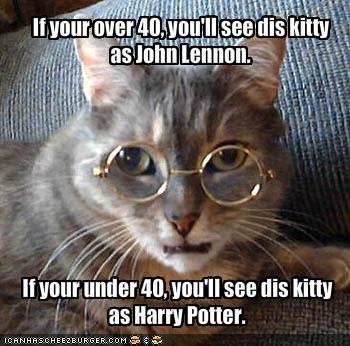
Let’s take a look at this kitty example. It’s not something serious, but it has a good point in showing how one metaphor looks ideal for you but might not be that good for the others who will be interacting with your icons. You have to make sure that the audience will get the idea behind the icon. Best way to know if the icon works for them is to ask about it.
To sum things up, I hope you got me right – your icon idea can be brilliant regardless of whether it was the first one or not. I just want you to avoid the common mistake of staying with the first idea rather then trying other approaches before you decide which to stick to. Try not to fall in love with your first icon idea and always look for better ways to deliver your message.
![]()


