You, as an icon designer, should not forget that nine times out of ten the icons you create are going to be used in some context rather then on their own. It could be an app, a website, a flyer, a book, a sign at the airport, etc. This means, the icon will make a huge contribution to the overall user experience. And great user experience is something you don’t want to underestimate. Your job is to make sure that your icons make it as pleasant and easy as possible for potential future users. So, that being said: What should you keep in mind when designing icons to assure great user experience?
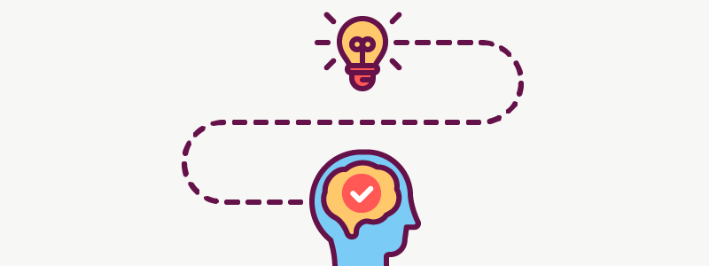
Does it convey the right message?
Icons should communicate a very clear and easily understandable message. Make sure you avoid icons with conflicting meanings.
Does it communicate with the target audience?
If you don’t have the specific target audience, you have already lost. Every app, website or service has their target audience. You should create icons that will talk directly to that audience.
Icons don’t have to be too sophisticated
The icon’s meaning has to be as clear as possible. This means no hidden connotations, nothing too complicated that could mislead the user. It should take a couple of seconds to recognize and understand the icon.
Design icons within the context
If it is possible, always check how your icons looks like in the context they will be put in. Icons may look really nice and distinct on white background, the real question is though, is it as clear and good on a cluttered website or on the billboard at a crowded bus station.
Educate your client about how to use your icons
As a professional and icon designer, you need to teach your client about the best ways of using your icons, so that they can get the most out of it. For example, I like to make sure that icons I’ve created are being used with text labels. (And yes, icons should almost always have text labels.)
Justify your decisions
Always–always!–know why you did a certain thing the way you did it. Ask yourself why you’ve chosen the particular metaphor or what you’re trying to achieve with this exact shape or line. This way you will know that your icons hit your target audience.
Just ask
Commonly, the best way to see if your icons are clearly recognisable is just to ask people about it! Compile all the icons in one file without giving away any clues about what each of them means, send it to somebody who will be using the icons and ask them to describe what whey think each icon represents. The key is to pick somebody from the target audience. If you send the icons depicting parts of a bmx bike to your granny, chances are she wouldn’t have an idea of what that is. Unless, of course, she is a professional biker!
Look into how people interact with your icons
I know that most of the times it’s really difficult to test your design decisions. But if you have even a slight chance of seeing how people react to and interact with your icons — never miss it. Given a chance, show the app that features your icons to someone to see if everything looks clear to them. Do the A/B testing using different icons or icon variations, if possible.
All in all, always remember that you’re designing not pretty pictures–or not just pretty pictures–but rather people’s experiences. Your icons are going to be used by real people and it is your task to make their experience as smooth as possible. If they get frustrated because they don’t get the meaning of an icon or get lost in the app, they will most likely close it and don’t order the service your client is offering. It is a loss for everyone, so take your job seriously and design some amazing experiences!
![]()


