Hey guys! Hope your first autumn weekend was great!
So if you follow my work or at least read my blog from time to time you may know I love outline icons. I practice them daily and improve my skills and knowledge everyday. Today I thought I would share my own approach to outline icon design. Don’t worry, I won’t be talking about my process. Instead, I’ll cover some great tips for you to follow when creating outline icons.
Outline icons are the easiest to learn compared to all other icon styles. So they are great if you are just starting practicing icon design. But don’t get misled – outline icons may be easy to learn, but they are really hard to master. However, once you’ve made it, you can fit these icons into various projects, because outline icons are very adaptable. By implying different style variations you can make your outline icons look really “fluffy” and cheerful, or, quite the opposite, serious and corporate. This is a really powerful icon style.
Now let’s get to the “meat” – how to properly make your outline icon set?
![]()
It’s outline icons, for god’s sake. Use outlines!
When I started working with outline icons I was simply recreating outlines with various shapes. For example, instead of drawing a simple 20px long and 2px thick line I would make a 2px tall and 20px long rectangle.
It looked exactly the same, but it was a nightmare when I needed to edit the icon or change the line thickness. I would spend countless nights editing and tweaking the icons just because I somehow chose such a ridiculous working routine. Good thing I’m a crash test dummy at icon design, so you don’t have to repeat my mistakes!
This is probably the most important thing when working in icon design – use real outlines. It might seem a little confusing and harder to master at first, but believe me, it will be so much easier when you will need to change something.
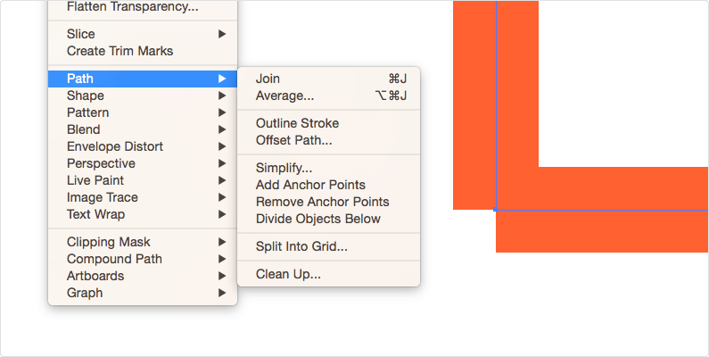
Join all the possible points.
When possible, join all the anchor points together. They should form one shape. You can connect two points by selecting both and clicking Cmd+J (if you are a Mac user). This way, the points will stay on their place even when you move or scale the icon.
If the points are not joined, Illustrator sometimes pushes one or another point to the side when trying to keep all pixels on the grid. So joining the points together will help you avoid this situation.
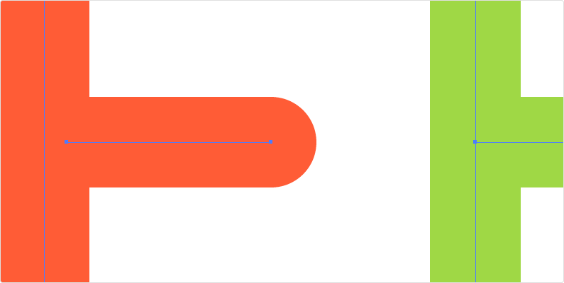
Always connect paths.
Look at the example image, on the left you’ll see the incorrectly connected paths, while on the right – the way they should be.
You may say you can’t see any difference, but everything changes when you decide to resize your icon or change the thickness of your outline. An icon with the connection showed on the right will stay the same no matter what you do – change the outlines, resize the icon, etc. The icon on the left, on the other hand, will deform after the changes.
Use whole measurements for your strokes.
Yep. No 0,5 px stroke thickness. Here on Icon Utopia we are practicing pixel perfect icons. Using non-integral numbers will result in blurry icons, and that’s not what we want, is that?
Use even numbers for the stroke thickness
If you are planning on resizing your icons later, or simply use them in a different size, you should stick to even numbers. Yes, not only have you use whole numbers – they should also be even (2, 4, etc.).
Let’s say you want to resize your icon x2. If your icon outlines are 3px thick, and you make it twice smaller, you’ll end up with a 1,5px stroke. And what have I mentioned before? If you want your icons to be pixel perfect, you have to use whole measurements.
Always align stroke to the center of your path.
To change stroke alignment variations go to Stroke Panel (read till the very end of the article to find out more about it).
Believe me, I’ve tried out all the possible stroke alignments, including the variation of a few different alignments, and I can confidently say that aligning stroke to the center of your path is the best solution. Powered by whole even measurements and correctly connected paths, it is hands down the best of alignments.
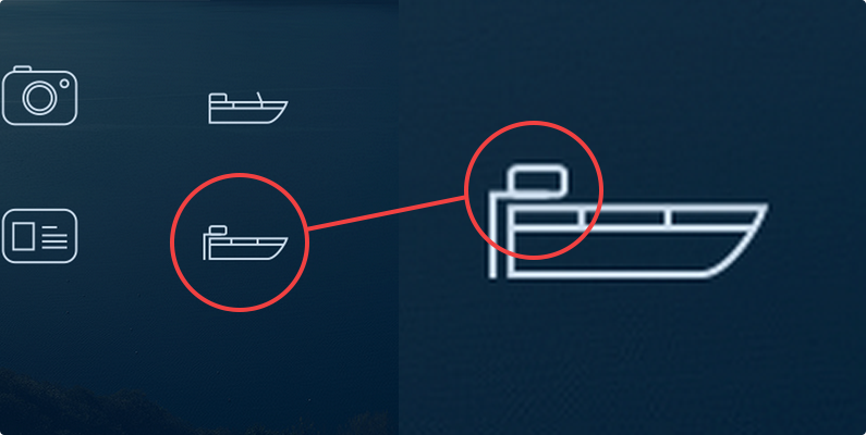
Don’t let the strokes overlap each other.
It shouldn’t be a big problem if you’ve made your icons pixel perfect. Overlapping outline “bugs” are common in the non pixel perfect icons.
Another reason why you your outlines shouldn’t overlap one another is because Adobe Illustrator likes to mess the overlapping outlines up when resizing your icons.
Take a look at one of my first icon sets, and you’ll see why you shouldn’t overlap your outlines 🙂 And yes, they are both overlapping and not pixel perfect. Boy, I’ve come a long way!
Use a stroke panel to control all your strokes.
It’s a number one tool for every designer working with the outline icons/illustrations. If you don’t see it in your Illustrator window, go to Window > Stroke and activate it. Most of the time you’ll only need the top part of this panel.
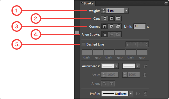
- Weight lets you set the thickness of the outline (Remember: even number and whole measurements only!).
- Cap defines how the ends of your outlines will look like. Butt caps make them straight, while Round caps give that soft roundish ending.
- Corner – its kind of self-explanatory, isn’t it? You can choose between the miter, round and bevel joins.
- Once again, your strokes should be aligned to the center.
- If you want your icons to have dashed outlines, you need to check this checkbox and define looks and dash/gap sizes. I like to make my dashed outlines manually, because Illustrator messes up sometimes while generating dashed outlines.
I hope this article made your life a little easier, and you’ve significantly improved your outline icon design process. I promise that if you apply all of the tips from above and stick to them, you’ll save a whole lot of time and be crafting outline icons with ease!
![]()


