by Justas | Dec 8, 2015 | Articles
Your first icon idea sucks. Okay, it may not be that bad… Frankly, I just needed to really grab your attention. However, the truth is that most of the first ideas you have are indeed not your best ones. Sadly, we tend to completely fall for our first thoughts way too often instead of looking for a better solution. I know how exciting first ideas look. Also, people may say that they are the best ones. From my experience, there are countless ways to improve your icon by getting away from your initial thought. What you want to do is explore different alternatives in the beginning. Don’t stick to the very first idea of yours trying to perfect it over and over. Devote this time to going in various directions instead of wasting all of your creative energy on one and only approach. By no means I’m saying that the idea is bad simply because it came first! What I’m implying here is that you shouldn’t let it blind you from looking for something else. Just because icons are supposed to be self-explanatory and clearly understood from the first glance, doesn’t mean that your first association is the best one. This logic has a point, but the association is not the same as the execution, right? Even if your first metaphor is perfect, your first actual version of icon might not be. There are so many different ways of fitting the same metaphor into a tiny icon. Some are better than others, and it’s your responsibility as a professional to find the most suitable one! So how do you...

by Justas | Dec 4, 2015 | Inspiration
Once again I’ll present you collection of great icon sets I’ve collected through the week. It’s nice to see so many different styles and interesting approaches on icon design. I’m sure you will discover some great icon designers and awesome icon...
by Justas | Dec 1, 2015 | Icon Tutorials
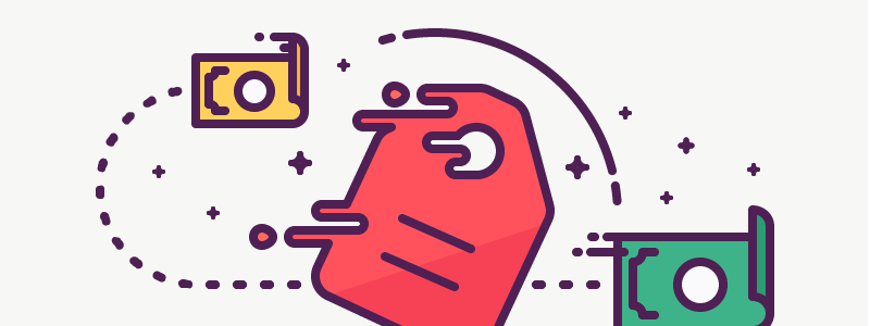
Hey, guys! This week I decided to go with the how-to and make a tutorial about the vector icons with the illusion of moving. Or as I call them – liquid, because these icons look as if they are melting. I haven’t worked on this style for a while now, however, I get a lot of requests to put together a tutorial on them. Your wish is my command! First of all, I can tell from my own experience that it’s really difficult to create a whole set of icons in this particular style alone, and it doesn’t certainly work for every icon. So use it at your own risk. If you ask me, in my opinion, it looks best with stand-alone illustrations like this one I did some time ago: Before we start working on the whole melting/liquefying effect, we should create a glyph icon, or use the one from the archive. For this tutorial I’m going to use the price tag icon I created recently. I suggest taking the icons with rounded corners, because they go better with the rounded stripes. This style is great for creating the illusion of a fast moving object! If you want your icon to create the illusion of movement, tilt it to the right! Don’t be afraid to rotate it by 45 degrees to increase this illusion. It will give that dynamic feel to your icon and show that it’s going into certain direction. Since the price tag is already tilted, I don’t need to do it once again, but you can check it out and see how it looks like...

by Justas | Nov 27, 2015 | Inspiration
Once again I’ll present you collection of great icon sets I’ve collected through the week. It’s nice to see so many different styles and interesting approaches on icon design. I’m sure you will discover some great icon designers and awesome icon...

by Justas | Nov 24, 2015 | Articles
At times it seems that icons are really complex and hard to create. Guess what — it is easier than you think! When it comes to me, my every other icon is actually made using basic shapes. I rarely use the pen tool, circle and square are my main icon components. Complex icons can be created with simple shapes. You just need to look at them from a different angle. What you should be paying attention to are the main creating blocks of each icon. Icons are not redrawn pictures, they carry a specific message, so your job is help transfer this message and make the meaning of the icon bright and clear. You can’t just shrink an image and call it a day. As icons are to transmit a complex idea via a small pictogram, they should be “stripped down” to their essentials. This why working with basic shapes is a great idea. It doesn’t let the icon look more complex than it should. Also, it’s way easier to create sharp looking icons using basic shapes. The pen tool is not really suitable for making pixel-perfect curved lines. They require lots of adjustments to ensure that all the points are on the pixel grid sharp as a knife. When creating icons using the basic shapes though, you simply place these already created shapes on the pixel grid and look if everything is pixel-perfect. Look at these amazing animations by Paulius Kairevičius — they are one of the best examples illustrating icons created with basic shapes: I was completely blown away by how awesome these little presentations are. They...