
What are responsive icons?! You might wonder.
Although the responsive web is an absolute norm right now and the first responsive icons appeared a couple of years ago, not everybody knows what they are. The fact that they are not so widely spread these days raises a few questions. Are they really necessary? Do they provide good user experience? In today’s article we will analyze pros and cons of such icons, as well as what you should have in mind when creating them.
What are responsive icons?
First things first, responsive icons, just like the responsive web, react and change depending on what screen size you’re using to look at them. To put it simple, it’s a set of usually 2 to 4 different variations of the same icon. Basically, what changes is the amount of details used in the icon. When your screen gets smaller, the icon loses some of its details.
But why are responsive icons so important? Everyone who has designed at least a few icons in their career knows that if the icon looks good on 128px grid, it won’t always look as good on 32px. It requires a lot of skill to create an icon that will look equally good in different sizes and will still deliver the message clearly. And this is where the responsive icons step in. You take one icon and create different variations of it to look good in different resolutions.
So, implementing responsive icons is a little bit like cheating to make them look good in different resolutions and screen sizes. The best way to understand how they work is to see responsive icons in action yourself. Check out this cool presentation: http://responsiveicons.co.uk/ (resize your browser window to see the changes)
There are a lot of different opinions on responsive icons. Sometimes changing icons is really not the best idea for user experience purposes. On the other hand, if the icon gets unrecognisable in the small size it’s even worse!
Considering that the first responsive icon sets showed up a couple of years ago but are not yet that widely used, demonstrates that it’s not that necessary to have them. Or at least, you don’t have to use them the way showed in the presentation above.
Nevertheless, I think creating different size variations for the same icon can be a true lifesaver! I often design multiple-sized icons when I know I’ll be using them in different situations as a representation of the same item. For example: bigger, more detailed icon in for the Features page, and small 16×16 version of the same icon for the Menu.
How to create a good responsive set?
There are a few things to keep in mind when designing a responsive icon set.
1) Icons must look super consistent in style. There is enough stress for a user to open a mobile version of a webpage they used to scroll on the desktop in the first place. And this leads to a really bad user experience if one of the icons a user was familiar with suddenly changes unrecognisably. As an icon designer you have to make this transition as smooth and simple as possible. An icon should slightly change maintaining all the colours, style and the feel of its bigger brother.
2) Always start working from the smallest icon. The smallest icons are the most difficult to create, that is why you need to start from them. Adding details to the icon is way easier than removing them. It’s especially important if your smallest icons are going to be 16x16px. Designing them is really difficult, so you should definitely do them first.
3) It is usually unnecessary to have many different steps. In most cases, 2-3 are just enough.
What is the future of responsive icons?
To be honest, when I saw responsive icons for the first time I was amazed. I thought they were the future of icon design. But the more I worked on icons, the more I understood that responsive icons would never take over. Don’t get me wrong, sometimes they are very useful, especially when working on some custom solutions for a client. And whatever the case, I think every icon designer should have knowledge and experience of creating responsive icons. However, have in mind that it will probably never become a worldwide established norm for icon design.
Get Inspired!
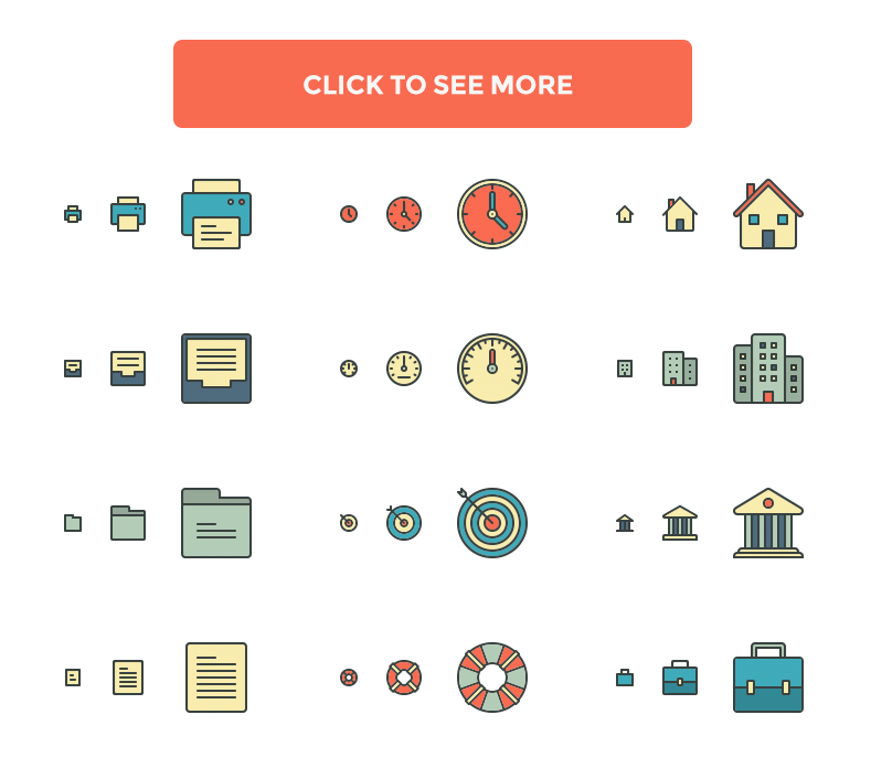
And to boost your inspiration to try out this yourself, check out these great responsive icons by Pixel Bazaar:


